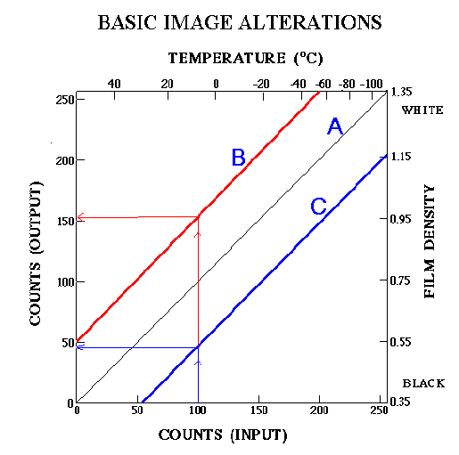
1.
(a) How does the changing the enhancement curve
from "unenhanced"
(curve A) to curve B change a satellite image? Give a
specific example
of how the same temperature is represented differently on the
image by
the different curves.
(b) How does changing the enhancement curve
from "unenhanced" (curve A) to curve C change a satellite
image? Give
a specific example of how the same temperature is represented
differently
on the image by the different curves.
2.
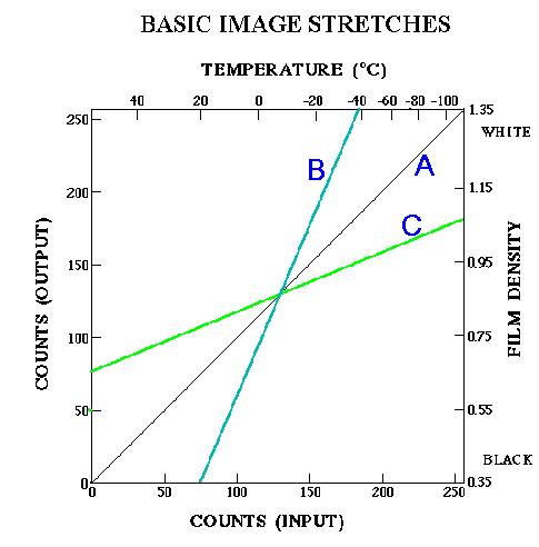
(a) How does the changing the enhancement curve
from "unenhanced" (curve A) to curve B change a satellite
image? How is
a temperature of -40 deg C represented differently (in terms of
grey shades)
on the image by the different curves? How is a temperature of
about 20
deg C represented differently (in terms of grey shades) on the
image by
the different curves?
(b) How does changing the enhancement curve
from "unenhanced" (curve A) to curve C change a satellite
image? How is
a temperature of -110 deg C represented differently (in terms of
grey shades)
on the image by the different curves? How is a temperature of
about 55
deg C represented differently (in terms of grey shades) on the
image by
the different curves?
3.
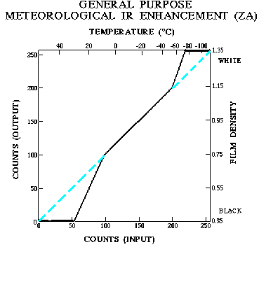
In the above figure, the ZA enhancement curve is
shown
by the solid black line. The unenhanced curve is shown by dashed
lines
where it deviates from the ZA curve. Explain how the different
segments
of the ZA curve would change an unenhanced satellite image in
terms of
how the following temperature ranges are represented by grey
shades.
55 deg C to 29.4 deg C
29.2 deg C to 6.8 deg C
6.7 deg C to -55.7 deg C
-56.0 deg C to -75.2 deg C
-75.7 deg C to -110.3 deg C